Analytics
May 27, 2026
What is data analysis report & how to write one (examples & tools)


If you run client campaigns, you know the drill: the end of the month arrives, and suddenly it’s a scramble to turn raw numbers from a dozen platforms into something your clients will actually read. Without a clear and well-structured report, you risk delivering pages of data with no real story — and no way to prove your value.
A data analysis report fixes that.
It turns scattered metrics into a clear, concise narrative that explains what happened, why it happened, and what to do next. In this guide, you’ll see exactly how to build one that clients trust — with examples, tools, and time-saving automation tips.
We’ll also show how Reporting Ninja can handle the tedious parts of reporting, so you can spend more time on insights and strategy, not spreadsheets.
A data analysis report is a structured document that organizes your findings from raw data into a clear format for decision-making, whether you’re analyzing marketing data, sales performance, or website analytics. It distills large, complex datasets into the key points that matter most, supported by relevant context and evidence.
These reports combine quantitative data (metrics, KPIs, conversion rates) with qualitative context (market conditions, campaign timing, audience behavior) to give a complete picture. They’re used by agencies, in-house teams, and consultants to track performance, guide strategy, and align stakeholders around the same facts.
Before you start building your report, it’s worth knowing exactly what needs to go in. These elements ensure your report is focused, easy to understand, and valuable for the people reading it — whether that’s a client, a manager, or your own internal team.
Every good report starts with a clear purpose. Spell out what questions you’re trying to answer or what goals you’re measuring against. This helps you filter out irrelevant data and keeps the analysis targeted. For example, if your objective is to assess ad performance, you don’t need a full breakdown of organic traffic.
Choose metrics that directly support your objectives. Overloading the report with every data point you have makes it harder for the audience to see what matters. A social media report might focus on engagement rates and click-throughs, while a sales report centers on conversion rates and revenue growth.
Well-designed visuals make data easier to digest and spot trends quickly. Use charts, graphs, or dashboards to highlight key changes or comparisons over time. For instance, a line graph showing month-over-month conversions is easier to interpret than a raw table of numbers.

Metrics alone don’t tell the full story. Provide the “why” behind the numbers — was there a seasonal dip, a campaign change, or a competitor launch that impacted results? This context turns a static report into a decision-making tool.
End each section with practical next steps. If click-through rates are dropping, suggest testing new ad creatives or adjusting targeting. Action items show you’re not just reporting data — you’re using it to drive improvement.
Including these core elements ensures your report is focused, easy to read, and built for decisions — not just documentation.
The right tools make the difference between a report that takes hours to build and one you can deliver in minutes. Each option below is matched to a common reporting use case, so you can pick based on your goals, team size, and client demands.

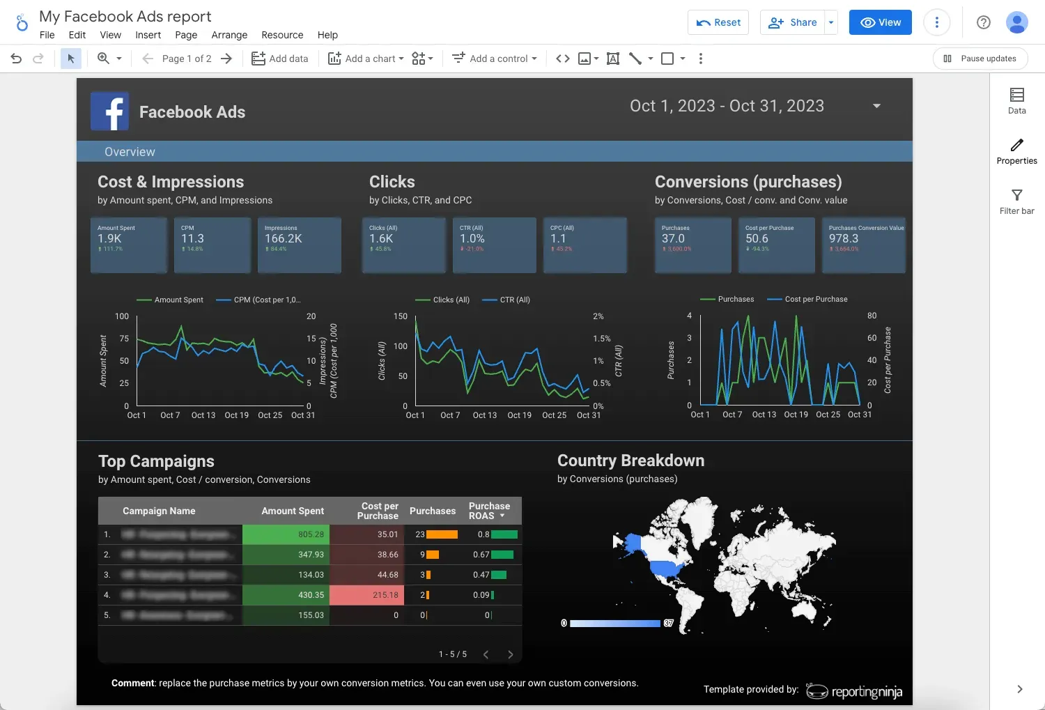
Designed for marketing agencies and consultants, Reporting Ninja centralizes data from over 30 major sources — including Google Analytics, Google Ads, Facebook Ads, LinkedIn, and SEO tools — into a single workspace. You can:
Its real advantage is speed: you can go from raw data to a client-ready, visually polished report in minutes without touching a spreadsheet. That means less time formatting and more time interpreting results and making recommendations.
{{cta-block-v1}}
A free Google tool for combining multiple data sources into interactive dashboards. It’s a good choice for teams that already work in the Google ecosystem and need a flexible, visual format. However, it demands more setup and manual customization than automated platforms like Reporting Ninja.
Tableau is a leading platform for creating interactive, highly customizable visual reports. It’s well-suited for organizations with complex data needs and in-house analysts. While it offers deep functionality, it has a steeper learning curve and higher cost than most other reporting tools, making it less practical for smaller agencies.
Power BI is designed for teams that need in-depth business intelligence alongside reporting. It integrates well with Microsoft products and supports complex data modeling. However, its interface can feel overwhelming for beginners, and setting up automated client-ready reports requires much more configuration than simpler tools like Reporting Ninja.
There’s no single “best” reporting tool — it’s about matching features to your needs. Whether you prioritize automation, real-time tracking, or advanced visuals, the right tech stack can cut reporting time dramatically and improve the quality of insights you deliver.
A good data analysis report doesn’t just appear — it’s the result of a structured process. Following clear steps ensures your report is accurate, relevant, and easy for your audience to act on.
Start by identifying the exact questions your report needs to answer. This keeps your analysis focused and prevents unnecessary data from creeping in. For example, a report aimed at improving ad spend efficiency should center on cost-per-click, conversion rate, and ROI — not broader brand metrics.
Pull data from all relevant sources and check it for errors, inconsistencies, or duplicates. Clean data is essential for accuracy, especially if you’re combining multiple platforms. Tools like Reporting Ninja automate collection and reduce the risk of human error, saving you hours of manual work.
Look for trends, patterns, and anomalies in the data. Numbers on their own are meaningless — add context that explains why they look the way they do. Was there a seasonal spike? A change in targeting? An algorithm update? This step turns raw numbers into insight.
Use charts, graphs, and tables to present your results in a clear, digestible way. Incorporating marketing data visualization techniques ensures your charts and graphs communicate insights at a glance. Choose visuals that match the type of data you’re showing - line graphs for trends, bar charts for comparisons, heat maps for distribution. Reporting Ninja’s built-in data visualization tools can handle this instantly.
End your report with a concise summary of key findings, followed by practical recommendations. This is where you connect the dots for your audience and make it clear what actions to take next. Actionable recommendations are what turn a report into a strategic asset.
Seeing real examples makes it easier to picture how a data analysis report works in different scenarios. Each example here focuses on a specific goal, the metrics to track, and the type of insight it should deliver.
Tracks ad spend, impressions, clicks, conversions, and cost per acquisition across multiple channels. The report should highlight which campaigns, audiences, and creatives delivered the best ROI, and where budget can be reallocated for better performance. With Reporting Ninja, you can automatically pull this data from all platforms into a single, branded report.

Analyzes traffic sources, bounce rates, average session duration, and conversion paths. The goal is to understand how users move through the site and where drop-offs occur. This helps prioritize fixes — like improving page load speeds or updating content — to increase engagement and conversions.
Breaks down leads by source, stage, deal value, and win rate. By spotting bottlenecks (e.g., too many stalled deals at the proposal stage), you can adjust sales processes or offer additional training. Forecasting capabilities also help with planning revenue and resource allocation.
Measures reach, engagement rate, follower growth, and content shares. Identifies which post formats and topics drive the most interaction, helping shape future content calendars. Pairing these results with campaign data reveals how social content supports broader marketing goals.
Whatever the use case, the most effective reports combine the right metrics, clear visuals, and context to turn raw data into decisions.
Even experienced analysts can fall into habits that make reports harder to read and less useful. Avoiding these mistakes keeps your reports clear, relevant, and impactful.
Including every available metric clutters the report and buries the real story. This makes it harder for clients to see what matters. Reporting Ninja lets you filter for only the most relevant KPIs, so each section stays focused on answering the core business questions.
Data without context can mislead. A drop in website traffic might seem alarming until you factor in seasonal trends or planned downtime. Reporting Ninja’s automated annotations allow you to add explanatory notes alongside metrics, giving clients the full picture without extra formatting work.
Crowded tables or confusing charts can make good insights easy to miss. The right visual should make the data more intuitive, not harder to read. Reporting Ninja’s prebuilt templates ensure every chart is clean, relevant, and easy to interpret.
Good reporting isn’t just about what you include; it’s about how you present it. By avoiding these pitfalls, you make your reports easier to understand and more likely to influence decisions.
A strong data analysis report turns complex data into a clear, actionable resource that decision-makers can trust. With the right structure and tools, you can produce reports that not only look professional but also drive real business impact.
Reporting Ninja takes care of the time-consuming parts — pulling data from multiple sources, creating branded visuals, and delivering reports automatically.
That means you spend less time formatting and more time advising clients, improving campaigns, and scaling your services.
Start your free trial with Reporting Ninja today and see how quickly you can go from raw numbers to client-ready insights.
{{cta-block-v1}}
Long enough to answer the key questions without overwhelming the reader — often 5–10 pages for most agencies.
A performance report focuses on results, while a data analysis report explains the results and provides context for decision-making.
A report is a structured document for review at a specific time, while a dashboard offers live, ongoing access to data.
Sign up for a 15 days free trial. No credit card required.

Build and automate amazing custom reports in a few clicks. Save time, be more productive, impress your clients.