Analytics
March 27, 2026
2026 Top web analytics dashboard examples, key types & how to use them


Every minute you spend jumping between GA4, spreadsheets, and ad dashboards is a minute you’re not optimizing what matters.
Scattered data slows decisions. Teams stall. Opportunities slip. And reporting becomes a time suck no one wants to own.
A web analytics dashboard fixes that. It pulls your most important metrics into one place—so you can stop digging and start improving.
In this guide, you’ll learn:
It’s your single source of truth for website performance.
A web analytics dashboard is a live interface that visualizes your most important metrics, like traffic sources, user behavior, and conversions, in one place, perfect for visualizing marketing data across channels.
No more jumping between GA4, spreadsheets, and marketing tools.
Instead of chasing data, you get a clear, real-time view of how users interact with your site—so your team can spot trends, fix issues faster, and move with confidence.
Because scattered data kills momentum.
When you’re toggling between platforms just to answer one question, insights come too late—and decisions lag behind. A web analytics dashboard cuts through the noise by combining key data into a single, actionable view.
It’s not just a prettier report. It’s a faster path to smarter decisions.

Different teams need different insights. Here’s how dashboards adapt to serve UX, marketing, SEO, and leadership—each tracking what matters most.
For UX designers and product managers focused on usability.
Tracks how users interact with your site—from first click to exit. Ideal for identifying friction points or drop-offs.
Key metrics: session recordings, rage clicks, scroll depth, time on page, exit rate.
For digital marketers managing campaigns across multiple channels.
Gives marketers a clear view of what’s working and what’s not across channels and campaigns.
Key metrics: traffic by source, cost per conversion, CTR, ROAS, campaign performance by platform.
{{cta-block-v1}}
For content and SEO teams optimizing for organic growth.
Focused on organic visibility and search behavior. Useful for tracking progress post-optimization or during content rollouts.
Key metrics: tracking keyword rankings, impressions, organic traffic, click-through rate, crawl errors.
For e-commerce managers and CRO teams optimizing sales funnels.
Built for product and revenue insights. Helps teams understand what’s driving conversions and where drop-offs happen.
Key metrics: product views, add-to-cart rate, checkout abandonment, revenue per visitor, average order value.
For founders, executives, and stakeholders who need quick answers.
High-level view for quick business insights—ideal for weekly check-ins or investor updates.
Key metrics: total traffic, goal completions, revenue trends, top traffic sources, conversion funnel summaries.
A strong web analytics dashboard brings clarity to your data by aligning the right metrics, tools, and visualizations around your business goals. Here’s a practical framework for building one that teams will actually use.
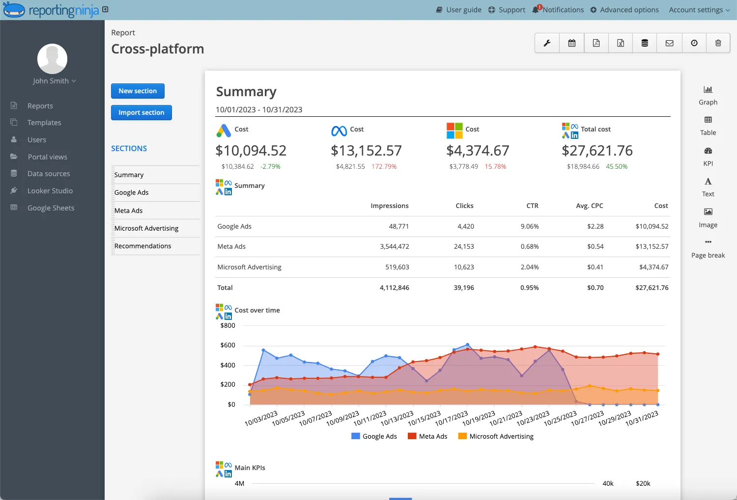
Start by selecting a platform that integrates smoothly with your data sources. Look for easy connectors, automation, and customizable layouts. Reporting Ninja is a solid choice if you want GA4, Google Ads, Facebook Ads, and Sheets data unified without the heavy setup of a BI tool.
Decide what questions the dashboard must answer and who will use it. A marketing team may need channel-level insights, while leadership might only want high-level KPIs. Setting clear goals prevents clutter and keeps your dashboard focused on decisions—not noise.
Identify where your key metrics live: GA4, paid channels, CRM, e-commerce, heatmaps, or SEO tools. Bring these into one place so teams aren’t jumping between tabs. A unified view reduces reporting friction and helps everyone work from the same truth.
Match each goal to specific KPIs such as traffic sources, conversions, ROAS, user paths, or engagement signals. Prioritize metrics that reveal performance changes or bottlenecks. Avoid vanity numbers that don’t influence decisions or budgets.
Organize your dashboard into logical sections: acquisition, behavior, conversion, revenue. Use visualizations that make insights obvious, like trend lines for performance shifts or funnels for drop-offs. Keep formatting consistent and remove anything that distracts from what matters.
A well-built dashboard streamlines analysis, removes guesswork, and gives teams the clarity to act quickly. With the right structure in place, you turn scattered data into insights that actually drive results.
Make reporting simple, clear, and automated.
Start your 15-day free trial of Reporting Ninja — no credit card required.
The right metrics don’t just provide insights through detailed website analytics reports, they show you what to fix, where to focus, and how to grow. A well structured metrics dashboard helps orgnize these insights clearyly, insuring your team tracks what truly drives impact. These are the five core areas every dashboard should cover.
Knowing how users arrive on your site is essential for prioritizing marketing and SEO efforts. A strong dashboard breaks this down clearly, so you can focus on the channels that drive results—not just traffic.
Behavior flow reveals how users actually move through your website—not how you hope they do. Understanding these patterns helps uncover friction, dead ends, or confusing journeys.
It’s not enough to get traffic—your dashboard needs to show whether visitors convert. Tracking key actions helps teams optimize funnels and measure the actual business impact of campaigns.
These quick-hit metrics tell you how engaging and relevant your content is. If users bounce fast or don’t stick around, something isn’t resonating, and your dashboard should flag it early.
User experience can vary dramatically by device and region. Your dashboard should account for this, so your decisions are grounded in how real users interact with your site.
{{cta-block-v1}}
Web analytics dashboards aren’t just about visualization—they’re about clarity, speed, and smarter decisions. They cut through noise, unify data, and turn performance metrics into clear next steps.
No more waiting for weekly or monthly reports. Dashboards show what’s happening now—so if traffic spikes, bounce rates climb, or a campaign underperforms, you’ll catch it instantly and act before it becomes a bigger issue.
Instead of switching between GA4, spreadsheets, and ad platforms, teams get one source of truth. Marketers, UX designers, and product leads can all work from the same dashboard—no silos, no duplicated effort.
Recurring reports become painless. Dashboards automatically pull and format the latest data, saving hours every week and ensuring consistency across teams or clients, making your entire web reporting process faster and more reliable.
When the right metrics are front and center, it’s easier to spot what’s working—and what’s not. Dashboards help teams prioritize fixes, allocate budget, and make data-backed calls without second-guessing.
For agencies and consultancies, dashboards provide an always-on window into performance. Clients can check results anytime—reducing the need for constant updates and reinforcing trust with clear, shared data.
A dashboard is only as useful as the habits behind it. Use these best practices to keep insights clear, consistent, and aligned with your goals.
Set a cadence—daily for campaigns, weekly for UX insights, monthly for leadership KPIs. Consistent review helps you spot trends early and act before performance dips become bigger problems.
Avoid relying on all-traffic views. Break results down by device, channel, location, or audience. Segmentation reveals friction points and high-performing segments that surface only when you drill deeper.
Dashboards show what happened, but not always why. Combine metrics with external factors like campaign changes, product launches, UX updates, or seasonality to make smarter, more confident decisions.
Periodically remove outdated KPIs or widgets that no longer support decisions. A lean dashboard improves clarity, reduces noise, and keeps teams aligned on the metrics that truly influence growth.
Make your dashboard accessible to marketing, product, UX, and leadership. Shared visibility reduces miscommunication, keeps everyone working from the same data, and speeds up cross-team decision-making.
{{cta-block-v1}}
Dashboards shouldn’t stay static. Ask teams what’s missing, what’s unclear, or what they never use. Iterating regularly ensures your dashboard stays relevant and genuinely supports day-to-day decisions.
A well-used dashboard becomes a living tool, not a static report. Review it, refine it, and let it guide the decisions that move your team forward.
Whether you're building internal dashboards, client reports, or cross-team overviews, the right tool depends on your goals, team size, and how technical you want to get. Here are five standout options across different use cases.

Built specifically for marketers and agencies, Reporting Ninja offers deep integrations with Google Ads, GA4, Facebook Ads, and more—without the complexity of a BI tool.

Google’s free data visualization tool is flexible and integrates well with GA4, BigQuery, and Google Sheets. But it assumes you’re willing to spend time customizing.

Unlike other tools here, UXCam is purpose-built for mobile UX analysis. It’s ideal for teams optimizing in-app flows rather than web sessions.

A heavyweight BI platform used by enterprise teams for complex data modeling and visualization. Powerful, but often more than most teams need.
Web analytics dashboards turn scattered data into clear, actionable insights. These examples show how different teams use dashboards to optimize performance, improve experiences, and make faster, more confident decisions.
A behavior dashboard highlights where users exit during signup or checkout flows. By visualizing drop-offs, scroll patterns, and page interactions, teams can quickly spot friction and streamline the path to conversion.
A marketing dashboard brings GA4, Google Ads, Meta Ads, and email metrics into one view. This helps teams compare channel efficiency, detect underperforming campaigns early, and reallocate budget with clarity.
An SEO dashboard surfaces ranking shifts, impression trends, and CTR changes. Content teams use this to monitor optimization work, identify keyword opportunities, and plan updates that compound organic growth.
A landing page dashboard shows traffic sources, on-page engagement, bounce rates, and conversions in one place. Marketers can quickly test variations, assess messaging clarity, and prioritize pages that need improvement.
A device-specific dashboard compares mobile, desktop, and tablet performance. UX teams use the data to find mobile bottlenecks (like slow load times or misaligned CTAs) and improve usability across key segments.
Dashboards make insights easier to see, share, and act on. Used consistently, they help teams stay aligned and make smarter decisions with far less guesswork.
{{cta-block-v1}}
Don’t start with features—start with your workflow.
Think about what you’re trying to solve: delayed decisions, messy reporting, or unclear performance. The right dashboard isn’t just a visual—it’s a tool for alignment, speed, and clarity. And it should feel like an asset, not another platform to manage.
If your team juggles ad performance, client updates, and e-commerce data metrics across too many tabs, it’s time to simplify. Tools like Reporting Ninja combine custom dashboards, Looker Studio connectors, and Google Sheets automation—all in one place.
No more toggling. No more digging. Just clear, up-to-date insights you can trust.
Start your free trial today and see what simpler reporting feels like.
A web analytics dashboard shows real-time, interactive data—ideal for spotting trends, monitoring live performance, and making quick decisions. A reporting tool, on the other hand, usually delivers static summaries on a scheduled basis, like weekly email PDFs or monthly slide decks.
Yes. Most modern tools—including Reporting Ninja—are built for marketers, UX teams, and business users. You can create dashboards using drag-and-drop interfaces, pre-built templates, or simple connectors—no dev support required.
It depends on the use case. For campaign tracking and performance monitoring, hourly or daily updates help you move quickly. For executive overviews or high-level KPIs, weekly updates may be enough. Most tools let you control this based on your workflow.
Sign up for a 15 days free trial. No credit card required.

Build and automate amazing custom reports in a few clicks. Save time, be more productive, impress your clients.