Analytics
February 23, 2026
Web reporting: How to create reports easily & save time (2026 guide)


If your “reporting day” starts with five tabs, three exports, and a spreadsheet you don’t trust, you’re doing web reporting the hard way.
Web reporting helps you create clear, reliable reports quickly by centralizing your data and automating updates.
In this guide, you’ll learn how web reporting works, why it matters in 2026, and how to create time-saving reports using the right process and tools.
Web reporting matters because most teams still lose time to manual data work and unclear numbers. Businesses using centralized, real-time dashboards make campaign decisions 25% faster and see 33% higher marketing ROI compared to those without.
Key benefits include:
Manual reporting eats hours every week. Pulling data from analytics tools, ad platforms, and spreadsheets doesn’t scale. Web reporting automates data collection and refreshes reports on a schedule, so you stop rebuilding the same views repeatedly.
This frees teams to focus on analysis instead of admin work, especially when managing multiple sites, clients, or campaigns.
When teams use different definitions for the same metric, reporting loses credibility. Web reporting enforces consistent calculations and shared dashboards, so everyone sees the same numbers.
This makes performance reviews faster, reduces back-and-forth questions, and helps teams act with confidence instead of debating data accuracy.
Stakeholders don’t want raw data. They want to know what changed, why it changed, and what you recommend next. Web reports surface the key metrics, trends, and comparisons that answer those questions, without forcing people to interpret charts on their own. This shortens review meetings and keeps decisions grounded in shared numbers.
Done well, web reporting turns scattered data into a repeatable, strategic reporting system your team can trust and act on.
Build web reports that drive decisions by focusing on process, clarity, and the right level of automation.
Start with one clear question. Is the report meant to show growth, explain a drop in performance, or compare channels? When the goal is clear, you avoid adding unnecessary charts or metrics.
Effective web reports focus on outcomes, not raw data volume, which makes them easier to review and act on.
Choose a small set of metrics that matter to the decision being made. Pull them from consistent sources to avoid mismatched numbers across tools. This is where reporting platforms help, by centralizing data connections and applying the same calculations across reports.
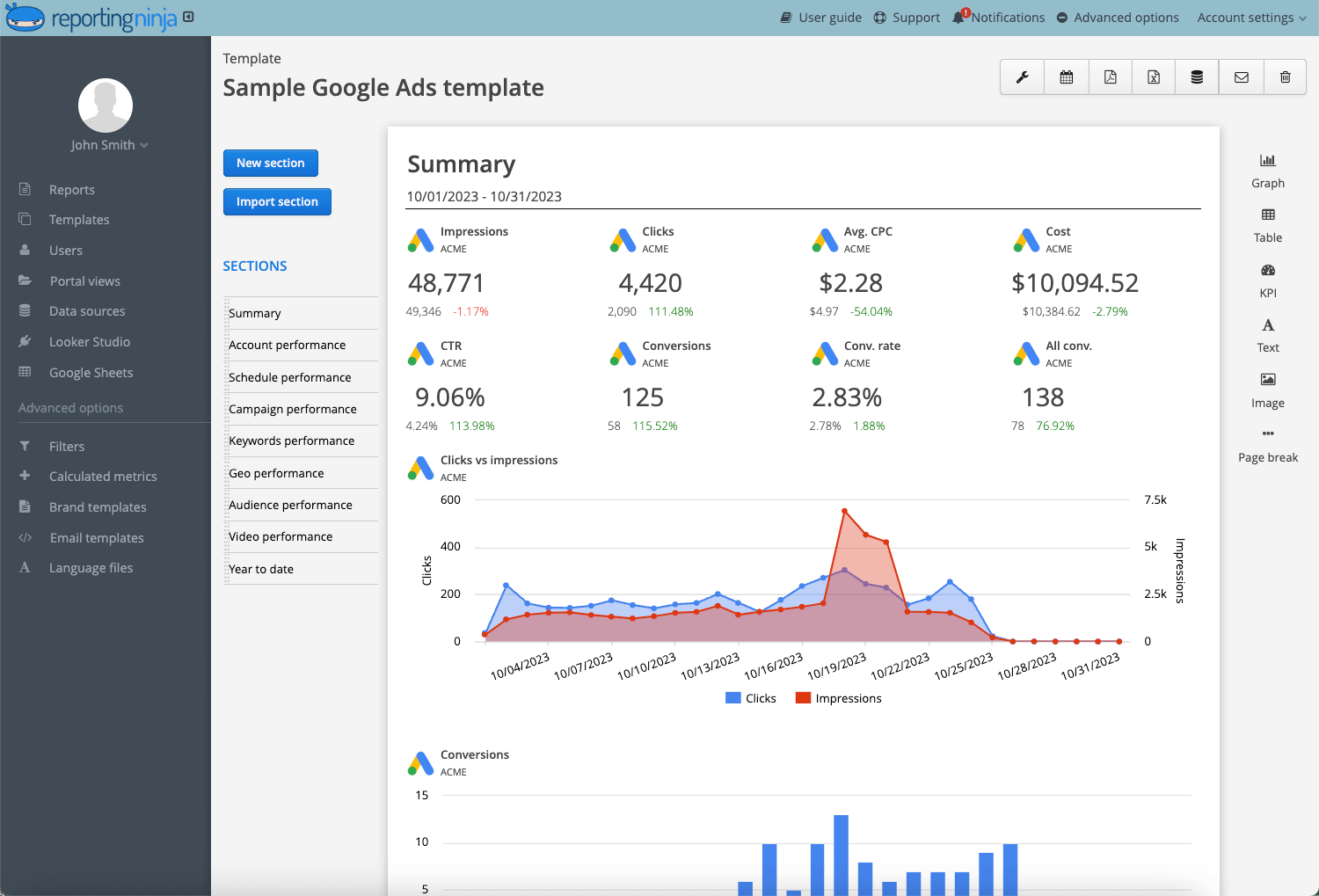
Tools like Reporting Ninja simplify this by connecting multiple platforms into one reporting layer.
{{cta-block-v1}}
Manual reporting breaks as soon as volume increases. Automation ensures reports update on a schedule and are shared without extra work.
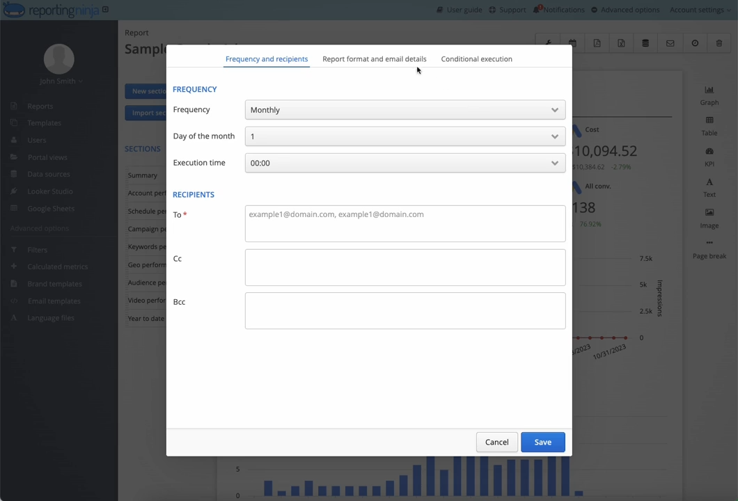
With Reporting Ninja, teams can build reusable report templates, auto-refresh data, and deliver reports to clients or internal teams without rebuilding them each week.
A good website analytics report is easy to read in minutes. Use simple layouts, clear labels, and short explanations for key changes. Avoid overloading metrics dashboards with charts that don’t support the report’s goal. Clear structure helps stakeholders understand what changed and what to do next.
A strong web report focuses on clarity and relevance. Every element should support a decision or explain performance. Anything else adds noise.
What to include:
What to avoid:
If your report helps someone understand what changed and what to do next in under five minutes, it includes the right content.
Below is a snapshot of standout reporting tools in 2026. Each entry highlights core features, pricing, key pros and cons, and who it’s best for.
Plans start at $20/month with all key automation features included; custom enterprise pricing available.
Pros: Strong automation, purpose-built for agencies, flexible report destinations.
Cons: Not as extensive for deep BI use cases compared with full BI platforms
Agencies and marketing teams that produce recurring reports across clients, and need automated delivery without heavy setup.
{{cta-block-v1}}

Starting at $49/month (paid monthly), with higher tiers for additional dashboards and users.
Pros: Easy to build dashboards, strong for weekly snapshots.
Cons: Less robust automation and multi-output delivery compared with dedicated reporting platforms.
Teams that want visual reporting quickly but don’t need detailed, multi-destination automation.
Free to use.
Pros: No cost, familiar Google environment, flexible data sources.
Cons: Manual setup; automation and scheduling are limited without add-ons.
Startups and teams with light reporting needs or tight budgets that already use Google’s ecosystem.

Pros: Strong multi-platform data aggregation, agency-focused templates.
Cons: Pricing can be high for smaller teams; onboarding complexity.
Most tools can create a dashboard. The real question is whether the tool will still save you time once reporting becomes routine. Focus on three practical areas: automation, integrations, and reusable report structure.
Automation determines whether reporting saves time or creates more work. Look for tools that refresh data automatically and deliver reports on a set schedule. This removes the need for weekly exports and manual updates. Reporting Ninja focuses on automated workflows, allowing teams to build reports once and reuse them without ongoing maintenance.
Strong integrations reduce data gaps and mismatched numbers. A good web reporting tool should connect directly to analytics, ad platforms, and SEO tools without workarounds. Centralized integrations ensure every report uses the same data sources and calculations, which avoids inconsistencies across teams and clients.
Reusable templates make reporting scalable. Instead of starting from scratch, teams can apply the same layout across clients or projects. Reporting Ninja supports flexible templates that can be adapted per use case, helping teams stay consistent while adjusting for different audiences.
The best tool isn’t the one with the most features. It’s the one that keeps reporting consistent and reduces effort every time you repeat the process.
{{cta-block-v1}}
A typical web report starts with a short performance summary, followed by key metrics such as traffic, conversions, and channel breakdowns. It then highlights changes over time, explains notable increases or drops, and ends with clear next steps. This structure helps readers understand what happened, why it happened, and what to do next without digging through raw data.
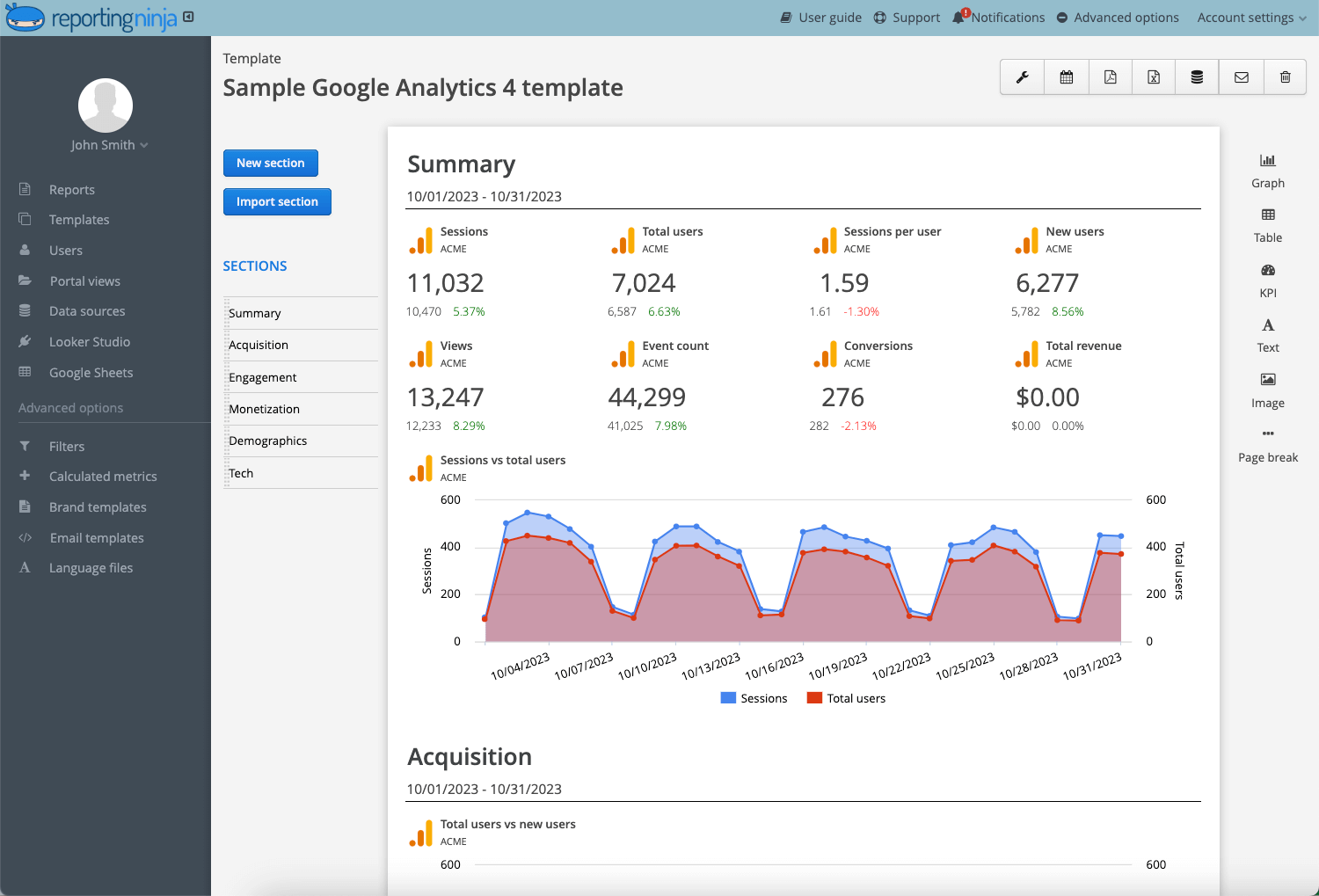
Reporting Ninja templates help teams quickly create decision-focused reports and ensure consistency across clients and internal stakeholders.
Manual reporting doesn’t scale. As channels, clients, and stakeholders grow, so does the time spent updating and sharing reports.
Reporting Ninja automates data collection, refreshes reports on a schedule, and delivers them in the formats teams already use. That means fewer exports, fewer fixes, and more consistent reporting week after week.
Set up Reporting Ninja once, schedule your reports, and stop rebuilding the same report every week.
Web reporting is the process of turning website and marketing data into structured reports that explain performance and trends clearly.
Yes. Automation removes manual exports and updates by refreshing and delivering reports on a schedule.
It does. Clear metrics and standard layouts reduce confusion and keep discussions focused on results.
Consistency. Everyone reviews the same metrics, which speeds decisions and avoids data disputes.
It depends. Weekly reports suit most teams, while monthly reports work for long-term performance reviews.
Sign up for a 15 days free trial. No credit card required.

Build and automate amazing custom reports in a few clicks. Save time, be more productive, impress your clients.