Analytics
June 26, 2026
How to create reports from Google Sheets & automate at scale



Creating reports from Google Sheets is easy. But keeping them updated every week or month is where things get messy.
Marketers use Google Sheets to combine data, build charts, and share performance reports. That works well, until you're pulling data from multiple platforms and repeating the same reporting process over and over.
This guide shows you how to create a report from Google Sheets, step by step, and how to automate that workflow when manual updates start taking too much time.
Most teams use Google Sheets for four primary report categories. Each one works manually but comes with its own scaling problem.
A marketing performance report pulls together the numbers that show whether your channels are working, such as SEO rankings, paid ad spend, website traffic, and conversion rates. Marketing teams build these weekly or monthly to show results and decide where the budget goes next.
In Sheets, you export data from each tool, paste it into a master file, then build pivot tables and charts by channel. A team running SEO, Google Ads, and Meta is pulling from three dashboards, each with its own date ranges and naming.
The work multiplies with every channel you add. If you miss one platform's export, the totals won’t reconcile.
A sales report tracks pipeline value, close rates, revenue, and individual rep performance. Sales managers use them to forecast and to see which deals are moving. The source is usually a CRM export dropped into Sheets.
QUERY and FILTER formulas summarize this well at a small scale. Once you go past a few thousand rows, load times slow down, and one broken reference throws off every downstream number.
The bigger problem is timing. A report built on Monday is stale by Wednesday because deals move daily. The sheet shows a snapshot rather than the live pipeline people are deciding from.
An operations dashboard tracks how work flows through a team, showing task completion, capacity, and workflow efficiency. Ops leads build them to spot bottlenecks and balance workload, usually pulling from several connected tabs.
That linked structure is powerful but brittle. Renaming a column in the source can break every IMPORTRANGE and VLOOKUP reference across every sheet that depends on them.
Diagnosing the error may take a lot of time, because Sheets only shows you the broken cell, not the cause. You’d have to trace references backward through tabs to find the one change that started it.
A client reporting dashboard is a recurring summary built for someone outside the team. Examples include monthly SEO reports, PPC recaps, and content performance breakdowns. Agencies and consultants do most of their work with these.
In Sheets, each client gets a separate file, its own formatting, and its own update cycle. Nothing carries over between them, but it’s this very use case that breaks first.
Five clients is a routine, but twenty is a month-end scramble, because the work scales linearly with every account you add. Each new client becomes another full reporting workflow to maintain.
Every Sheets report follows the same seven steps, from clean data to a shareable dashboard. Here's the full workflow before we break down each step.
Decide who reads the report and what decision it drives before you touch the data. That answer determines every metric you include.
Ask these three questions to settle your plan:
A client-facing PPC report and an internal ops dashboard pull from different numbers and serve different readers. Naming the reader first keeps you from building one report that serves neither well.
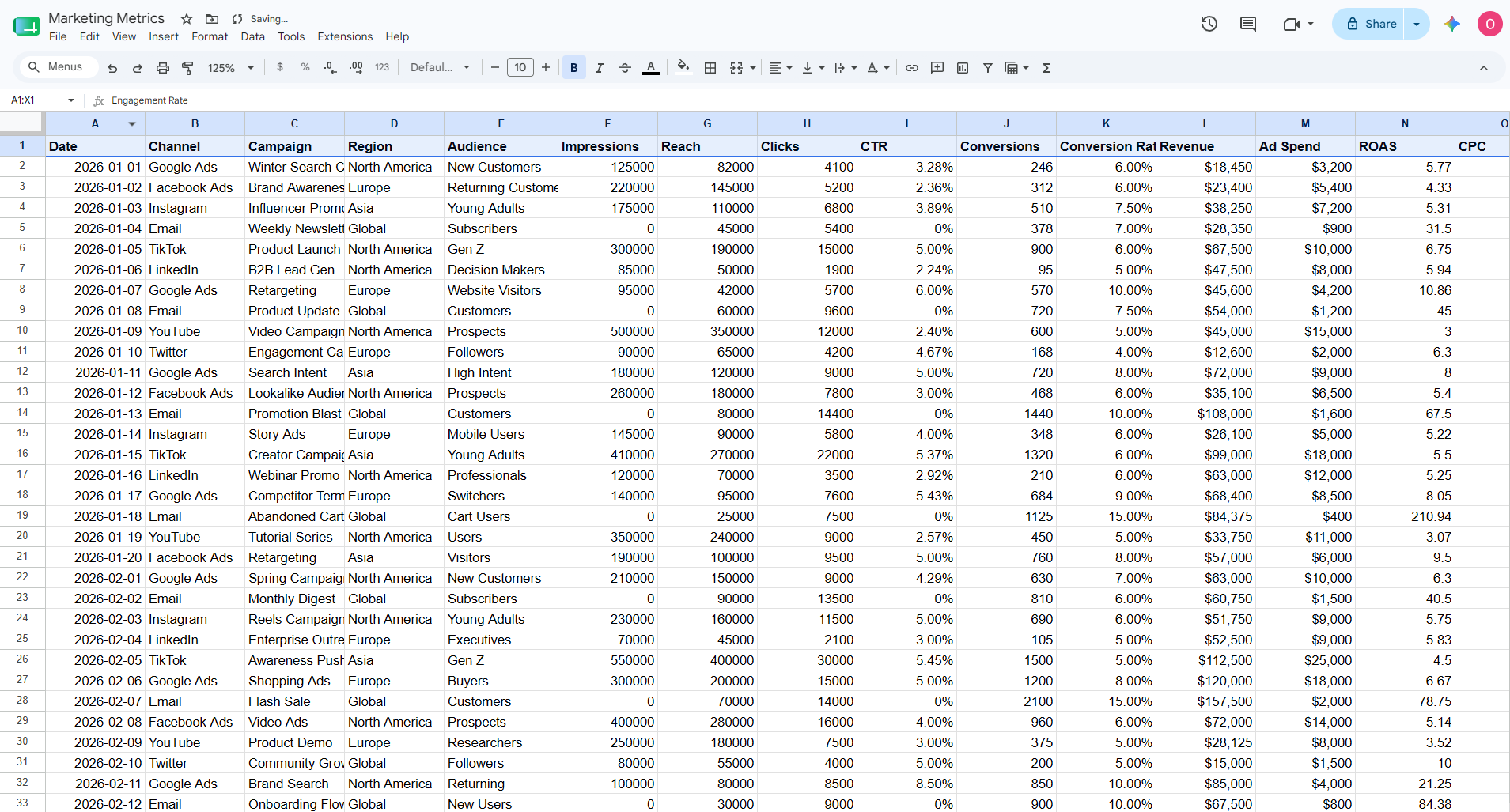
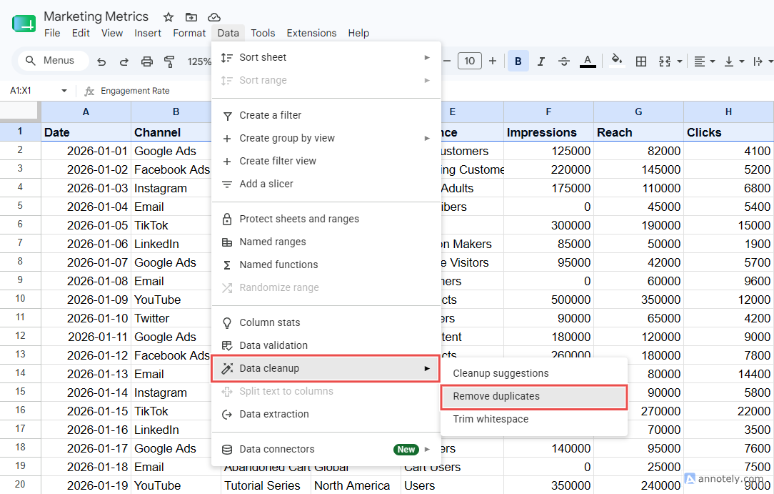
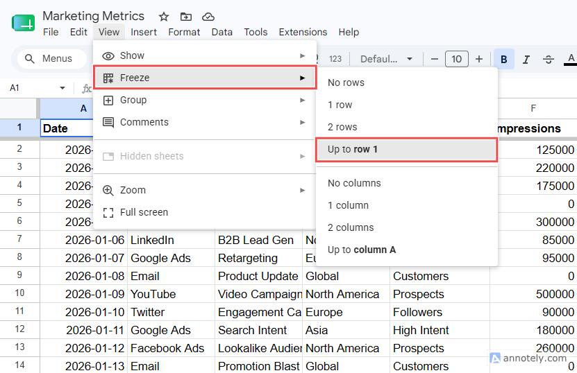
Put raw data on its own tab and never report from it directly. One structural edit to a shared tab breaks every formula downstream. After this, clean the source by:
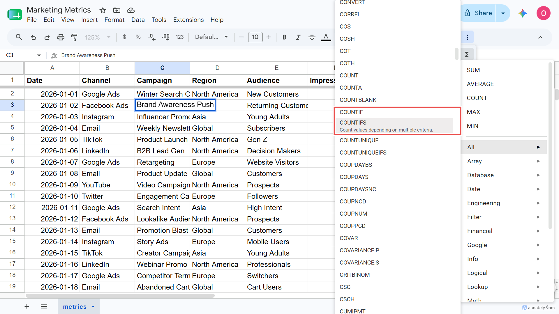
Formulas turn raw rows into the numbers people actually read, such as total conversions, cost per lead, revenue growth, and month-over-month change. These formulas will cover most reports:
Pivot tables summarize large datasets without needing a single formula. They group, count, and aggregate in a few clicks, which makes them the fastest way to turn thousands of rows into a readable summary.
To build one:
Select your data range, including headers.
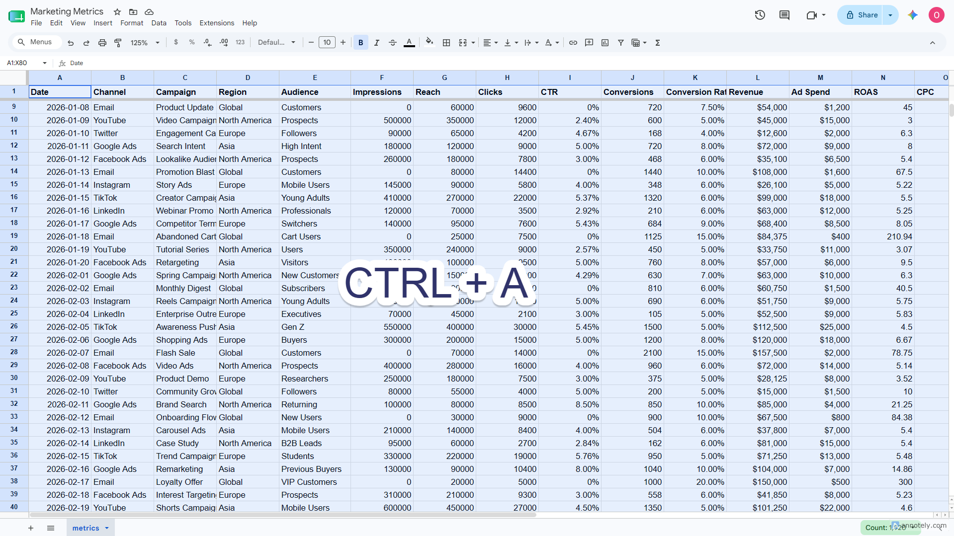
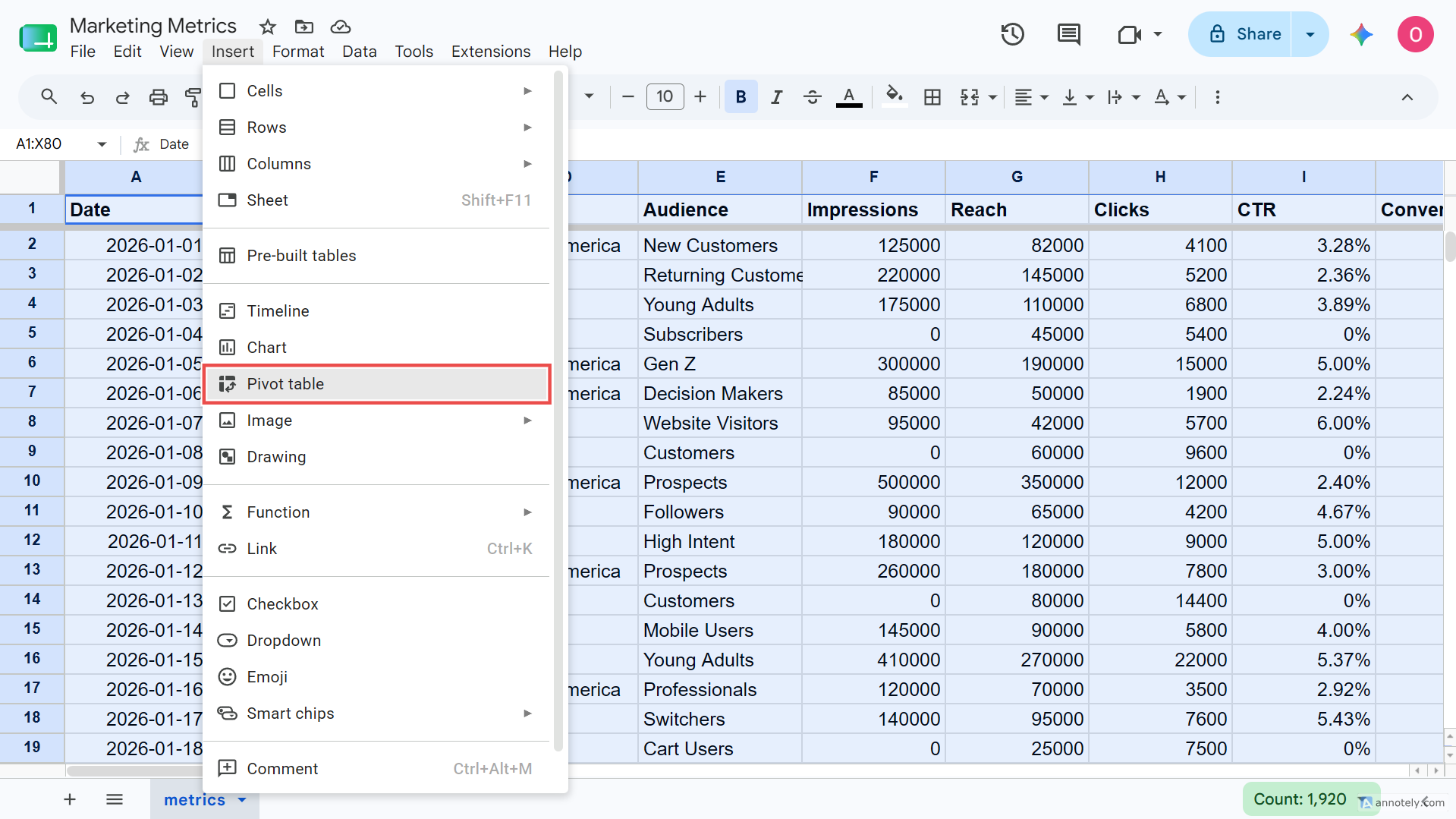
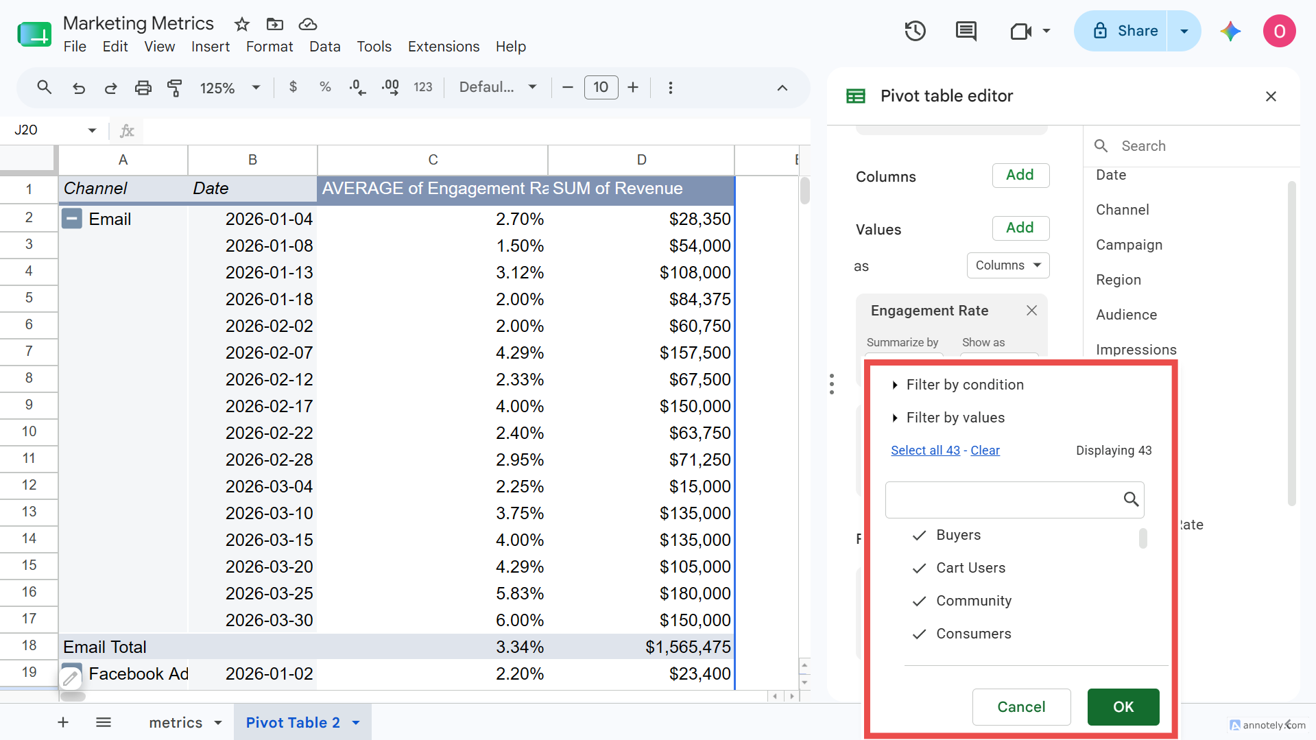
Go to Insert > Pivot table and place it in a new sheet.
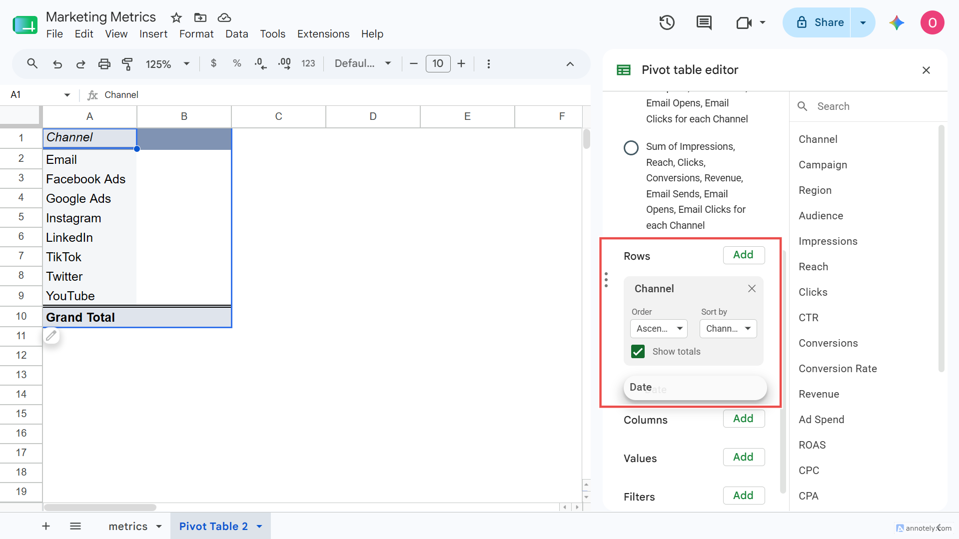
Drag your grouping field (e.g. Channel, Date) into Rows.
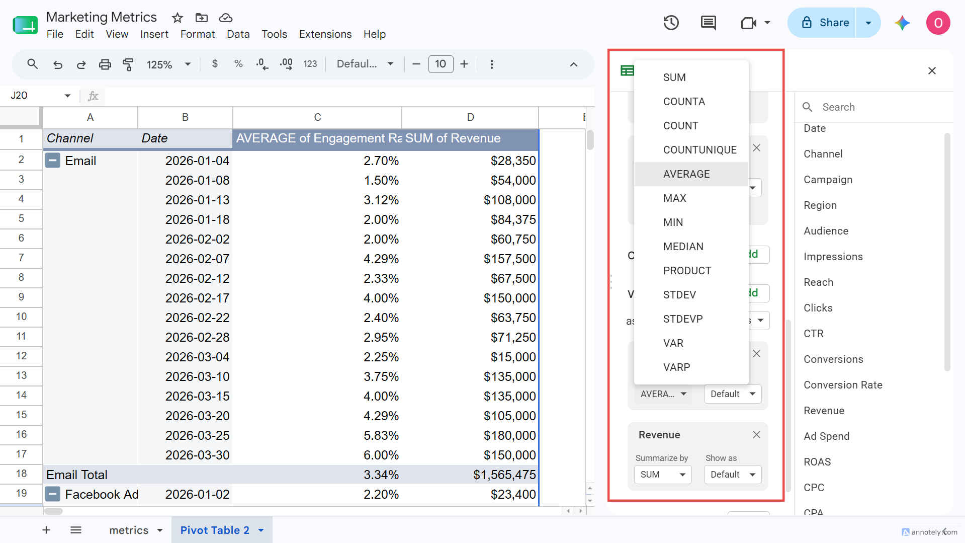
Drag your metric (e.g. Sessions, Revenue) into Values and set SUM, AVERAGE, or COUNT.
Add filters for date range or campaign if needed.
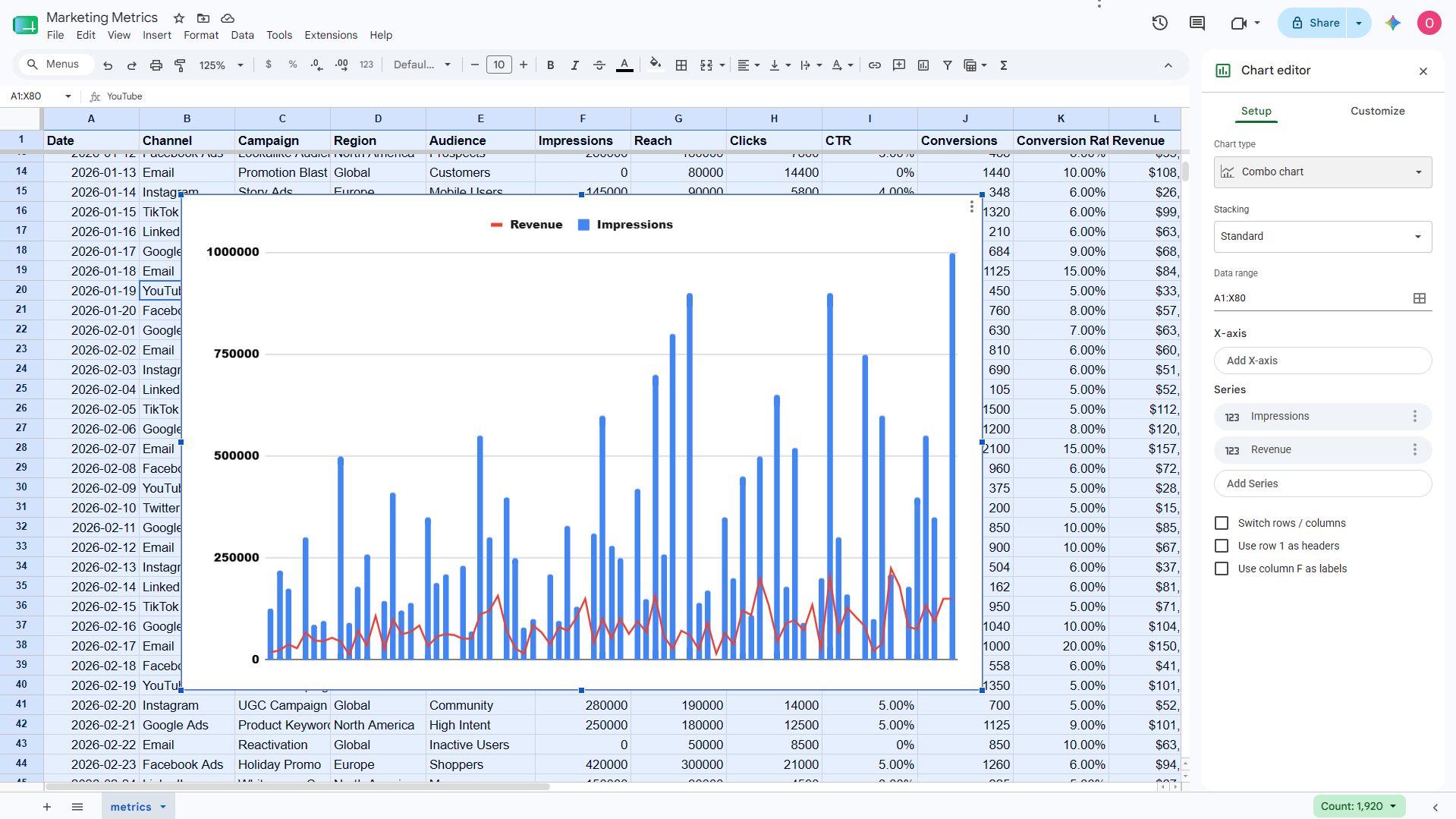
Charts turn a pivot table into something a reader understands in seconds. Match the chart to the question you're answering.
To build one, select the range, go to Insert > Chart, and pick the type in the Chart editor. Then, set your title, axis labels, and colors.
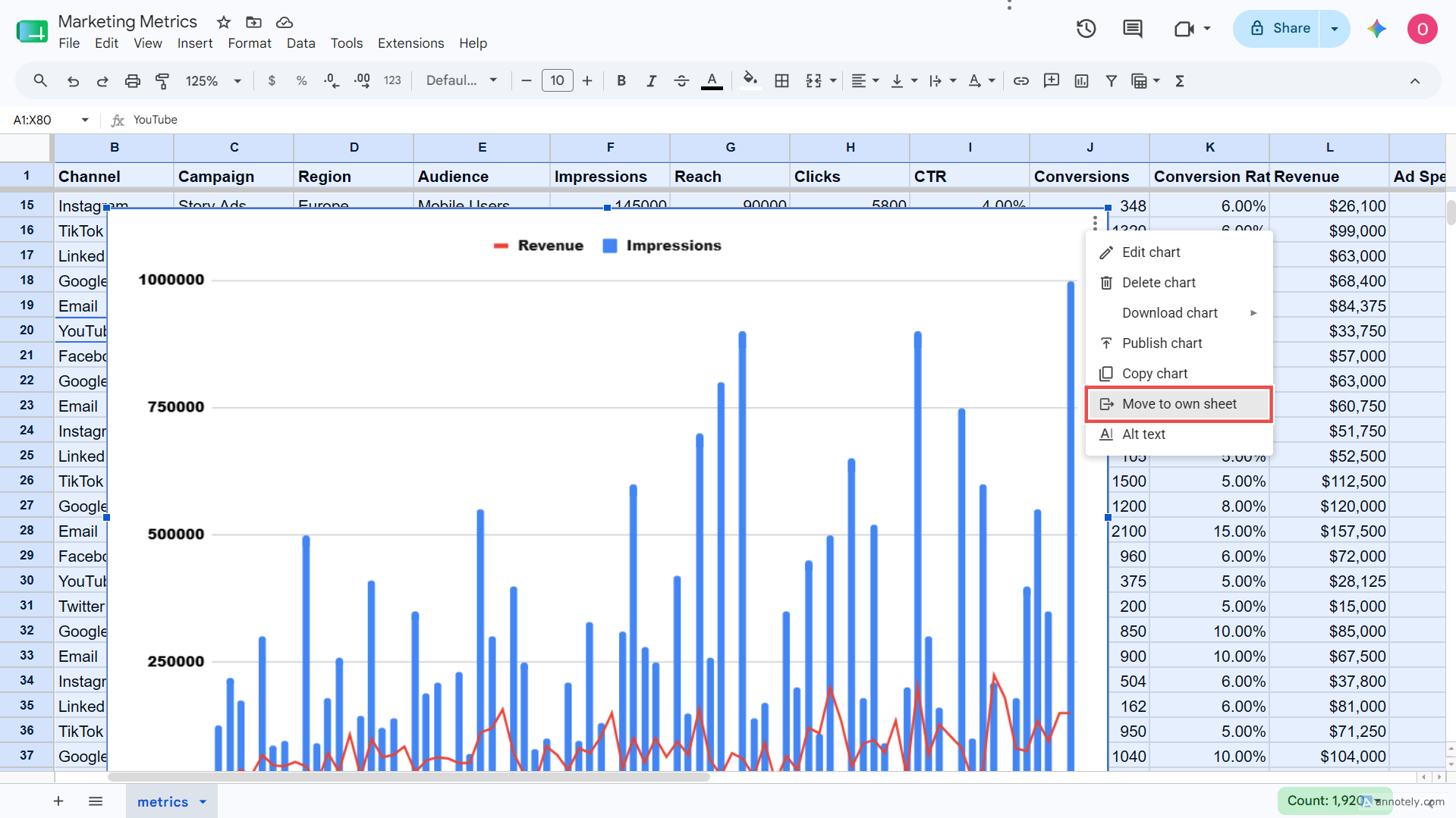
Click the ellipsis button at the top right of the chart and choose "Move to own sheet" to keep your Dashboard tab clean.
A report only works if the reader gets it fast and can't break it. Lock it down before it leaves your hands.
Before sharing:
Manual exports work until you're running them every week across several clients, and then they don't.
Most teams face the same limitations. They export from Google Ads, Meta, GA4, and Search Console by hand, paste each into Sheets, and rebuild the same report every cycle. Agency communities name recurring reporting as one of their biggest time drains.
Reporting Ninja's Google Sheets add-on pulls marketing data straight into Sheets, so you skip the manual export entirely. It gives you:
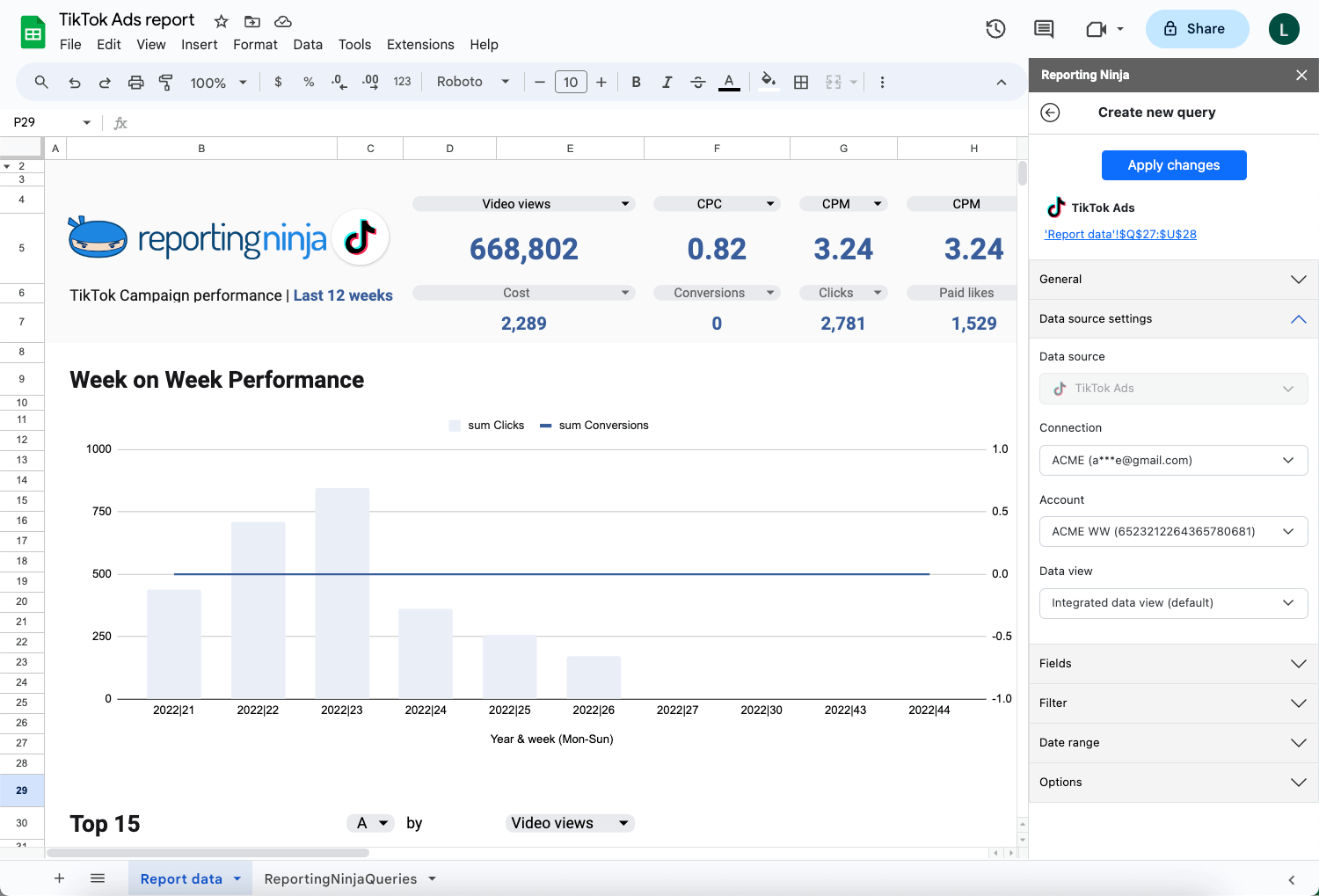
For agencies rebuilding the same reports each month, this is where the hours come back.
See the full list of supported data sources and integrations or start your free 15-day trial.
Here’s what three common report types look like when built manually in Sheets, versus what they look like when automated.
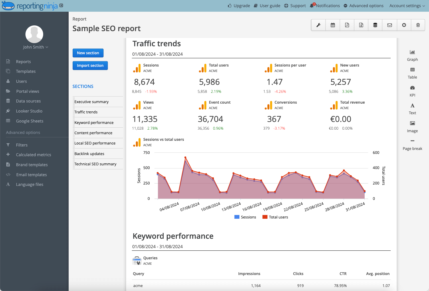
An analyst exports keyword rankings, traffic data, and conversion numbers from three separate tools each month. These get pasted into a master sheet, reformatted, charted, and emailed as a PDF each month.
Time cost: 3 to 5 hours per client.
The report pulls data directly from connected sources, refreshes automatically, and can be delivered on a schedule without manual updates.
Time cost: Under 15 minutes for setup, then zero ongoing effort.
See how Reporting Ninja handles SEO reporting end to end.
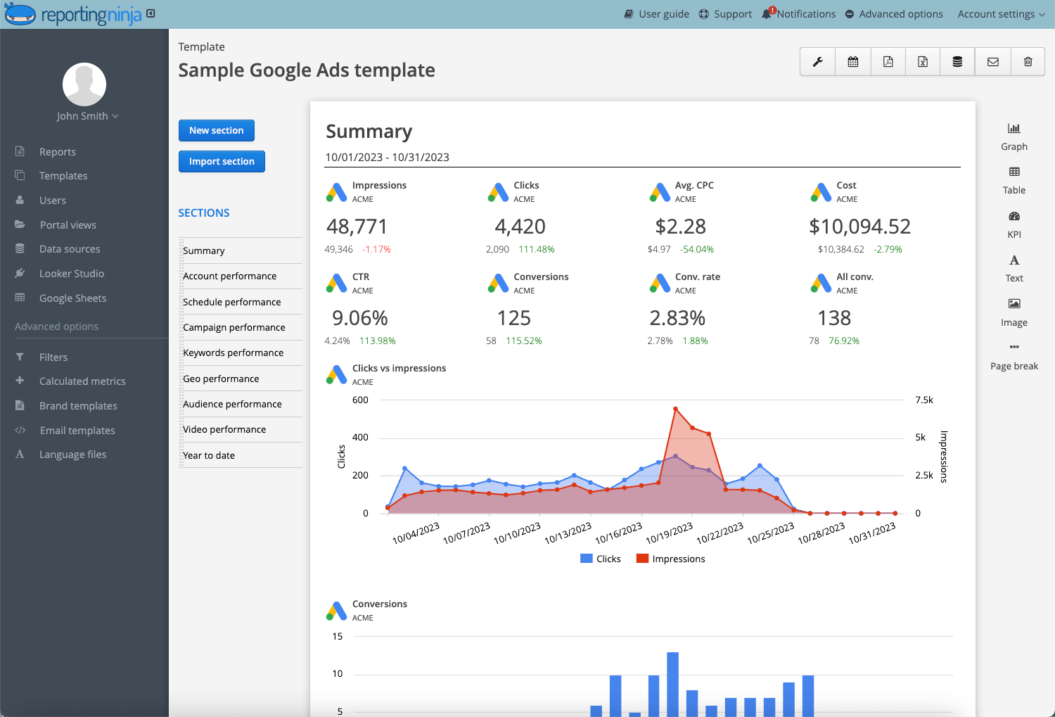
A media buyer exports Google Ads and Meta Ads data weekly, pastes it into a shared sheet, rebuilds the pivot table, and updates the charts. Any change in campaign structure requires reformatting the whole report.
Google Ads and Meta Ads data sync daily. The PPC dashboard updates automatically, and the account manager reviews (not rebuilds) the report each week. Significant changes trigger alerts, so nothing gets missed.
An agency operator maintains separate files for each client, some for SEO, some for paid media, and some for operational KPIs like task completion or SLA metrics. Every week or month, they spend 90+ minutes manually updating inputs, fixing broken sheet references, and reformatting before sending to clients.
The same data flows in from project management tools, ad platforms, and analytics. Dashboards are always current. The agency owner reviews trends and answers strategy questions instead of managing spreadsheets.
{{cta-block-v1}}
Even a well-built report can turn into a maintenance problem, thanks to some common mistakes. Let’s show you how to avoid them:
These practices improve report quality and reduce rework, whether you're working manually or starting to automate.
Instead of reporting clicks, sessions, and impressions, connect metrics directly to business results: leads, revenue, profitability, and customer acquisition. A client doesn't care about a 10% increase in impressions if it didn’t increase the number of leads or lower the cost per acquisition.
Never put charts and raw data side by side. Create a separate dashboard tab that pulls from your data tabs using formulas. This keeps your custom reports clean and makes it easy to share a single view without exposing raw data.
Color‑code your key metrics based on performance thresholds. Green is for above target, yellow for close, and red for below. This lets stakeholders scan the report in 10 seconds and know exactly where to focus.
How to do it: Go to Format > Conditional formatting and set rules per column.
Any tab that a stakeholder or client will view should be protected. Right‑click the tab, select "Protect sheet," and limit editing to yourself or a specific team member. This prevents accidental edits and keeps your report intact between reporting cycles.
Templates reduce reporting time and create consistency, especially for agencies managing multiple accounts. Build a master template with your preferred structure, formulas, and formatting, then copy it for each new client instead of starting from scratch.
Further reading: For a deeper look at pulling in custom data, see this beginner's guide to custom data sources.
Manual reports decay quickly, and data becomes outdated within days. If you're pulling from Google Analytics or Google Ads, Reporting Ninja’s native add-ons for those platforms let you schedule data refreshes without leaving Sheets.
{{cta-block-v1}}
Google Sheets is rarely used alone for serious reporting. Most teams add a tool from one of three categories, depending on whether they need to visualize data, move it, or automate the whole reporting cycle.
Most tools either visualize your data or help you move it, but not both. Reporting Ninja covers the full workflow, pulling data, refreshing reports on a schedule, and delivering them to clients without the manual steps in between.
That makes it a fit for teams whose reporting needs vary by client. The same account that handles a scheduled SEO report for one client can as well provide a live website performance dashboard for another.
Want a broader view of your site's performance alongside your marketing data? See how Reporting Ninja's website reporting tool brings it all together.
Google Sheets remains one of the most flexible reporting tools available, especially for ad hoc analysis and lightweight dashboards. The challenge majorly lies with maintaining them as reporting frequency, data sources, and stakeholder demands increase.
Reporting Ninja is built for that next step. It connects directly to multiple data sources, auto-refreshes your reports on a schedule, and delivers them to clients without the copy-paste, without the broken formulas, and without the hours of formatting work each week.
Start automating your Google Sheets reports with Reporting Ninja today. Start your free 15-day trial.
Partially. Native add-ons for Google Analytics and Google Ads let you schedule refreshes for those sources. For everything else, a connector tool like Reporting Ninja pulls data from multiple platforms into one sheet and refreshes it on a schedule, so you skip the manual exports entirely.
Use the built-in tools. Pivot tables summarize your data, the Chart editor visualizes it, and viewer-only sharing or PDF export distributes it at no cost. This works well for one-off reports. The cost shows up later, in the hours spent rebuilding recurring reports by hand.
Yes, for flexible, low-volume reporting. It's free, familiar, and easy to customize. However, it struggles once you're pulling from many sources or running the same reports every week. At that point, most freelancers and agencies add an automation layer rather than switch tools entirely.
It depends on your needs. Looker Studio is strong for visuals, and Supermetrics for broad data imports. Reporting Ninja is in-between, automating the full reporting workflow at a lower cost than enterprise platforms. It's built for marketers and analysts, so familiarity with reporting concepts helps.
Hours for the first build, then less each cycle once your template is set. A monthly multi-channel report can take three to five hours manually. Automating the data import cuts ongoing work to a quick review instead of a full rebuild.
Sign up for a 15 days free trial. No credit card required.

Build and automate amazing custom reports in a few clicks. Save time, be more productive, impress your clients.