SEO
May 14, 2026
SEO report dashboard ROI: set up, track & prove SEO impact


Building an SEO ROI dashboard sounds simple until you need to prove what organic search actually contributed. Traffic is easy to show. Revenue impact is harder.
A strong dashboard should connect rankings, clicks, and sessions to conversions, revenue trends, and business outcomes. That way, clients or stakeholders can see whether SEO is driving value, not just activity.
In this guide, you’ll learn why many SEO dashboards fail, what a useful ROI dashboard should include, how to build one step by step, and how automated reporting tools can make the process easier.
Most dashboards report what happened in search; not what it meant for the business. Here are the three most common reasons they fall short.
Executives and clients care about leads, sales, and pipeline growth. When a dashboard can't link visibility gains to those outcomes, SEO looks like a cost rather than an investment. Metric selection isn't just a reporting choice, it's what determines whether SEO gets defended or cut at budget time.
SEO rarely works as a neat last-click channel. Someone may discover a brand through search, return later through email or paid media, and convert days later. If your dashboard only shows organic sessions and last-click conversions, it misses part of SEO’s influence.
This makes ROI harder to defend. SEO may be supporting lead generation, assisted conversions, and revenue growth, but that value will not show clearly if the dashboard stops at traffic. A stronger setup connects organic landing pages to conversion trends, assisted outcomes, and revenue-linked data wherever possible.
Too many dashboards are technically thorough but practically useless. Crowded widgets, disconnected charts, and metric overload create friction for anyone who isn't already deep in the data.
A useful SEO ROI dashboard makes three things immediately clear: what improved, what drove value, and what needs attention next. If a stakeholder needs a walkthrough to understand a report, the dashboard has failed.

A strong SEO ROI dashboard need not show every available metric. What it does need to show is performance in business terms: what changed, why it matters, and whether SEO is contributing to measurable growth.
These are the five core components every SEO ROI dashboard should include:
{{cta-block-v1}}
The most effective SEO ROI dashboards are built backwards: start with the business question, then choose the data and structure that answer it clearly.
Before building anything, decide what "return" actually means in your reporting context.
For an ecommerce brand, that's likely revenue and average order value. For a B2B SaaS company, it might be demo requests, qualified leads, or pipeline value. For a local services business, key local SEO reporting could be phone calls or form submissions.
Without this step, dashboards default to traffic metrics because they're the easiest to pull, not because they're the most useful.
Map ROI to a specific, measurable outcome before you touch any tool or template.
Once the end goal is clear, map the stages SEO influences on the way there. That usually means moving from impressions and clicks to landing page visits, on-site engagement, conversions, and then commercial impact.
Not every business can track every step perfectly, but Google Analytics can help your dashboard reflect the closest reliable path from search visibility to business result.
This also helps you separate useful metrics from noise. A ranking increase matters more when it happens on pages that drive leads or sales. A traffic spike matters less if those visits bounce and never convert.
A good SEO ROI dashboard is selective. It should show enough data to explain performance without burying the main point. In most cases, that means building a focused metrics dashboard around visibility, traffic quality, conversions, and revenue impact.
Avoid adding widgets just because the data is available. Each metric should explain value, diagnose a problem, or support a decision. If it does not, keep it off the main dashboard.
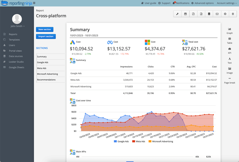
Not every reader needs the same level of detail. Executives usually want a quick summary of impact, trends, and next steps. SEO specialists may need page-level performance, keyword movement, and conversion insights.
A practical setup is to keep the main dashboard concise, then add detailed tabs or filtered views for deeper analysis. This gives decision-makers clarity while still giving practitioners enough data to act.
Manual reporting creates delays, inconsistency, and errors. Especially across multiple clients or accounts. Once your dashboard structure is set, automate as much of the data flow as possible.
This is where Reporting Ninja makes a real difference for agencies and marketing teams.
Rather than stitching data together from multiple exports, it centralizes key sources (SEO, PPC, social, email) into one place.
That means faster delivery, consistent numbers, and more time spent on analysis instead of admin.
{{cta-block-v1}}
Here are three practical dashboard formats, each suited to a different reporting audience and business context.
Built for fast decision-making. A marketing lead, client, or senior stakeholder should open this dashboard and understand performance in under a minute.
What it includes:
This format works best as an SEO dashboard for clients who want business clarity, not channel detail. Keep it to one screen if possible.
Before vs. after: A weak version is crowded with keyword charts and session data. A strong version leads with conversions, revenue trend, and a clear signal of direction. This is the kind of structure worth using when creating SEO report examples for clients.
Better suited to SEO managers who need to understand which search terms are driving commercial value (not just traffic).
What it includes:
The focus stays on high-intent terms, not a long list of minor ranking shifts.
Clean vs. cluttered: A clean version highlights a shortlist of high-impact terms and the pages behind them. A cluttered one dumps hundreds of keywords into one report with no prioritization.
The strongest format when SEO contributes across a longer customer journey. Rather than treating organic search as a simple traffic channel, it shows where SEO influences the funnel from first visit to conversion.
What it includes:
This view is often the most persuasive for PPC reporting teams and multi-channel agencies because it shows SEO in context rather than in isolation. When organic search is competing internally with paid media for budget, a funnel view makes its contribution undeniable.
Ready to build these dashboards without the manual work? Reporting Ninja helps you centralize marketing data, automate reporting cycles, and present SEO performance in a format stakeholders can follow. Start your free trial today.
The right SEO reporting tool depends on how much automation, customization, and cross-channel visibility you need. Here's how the top options compare.
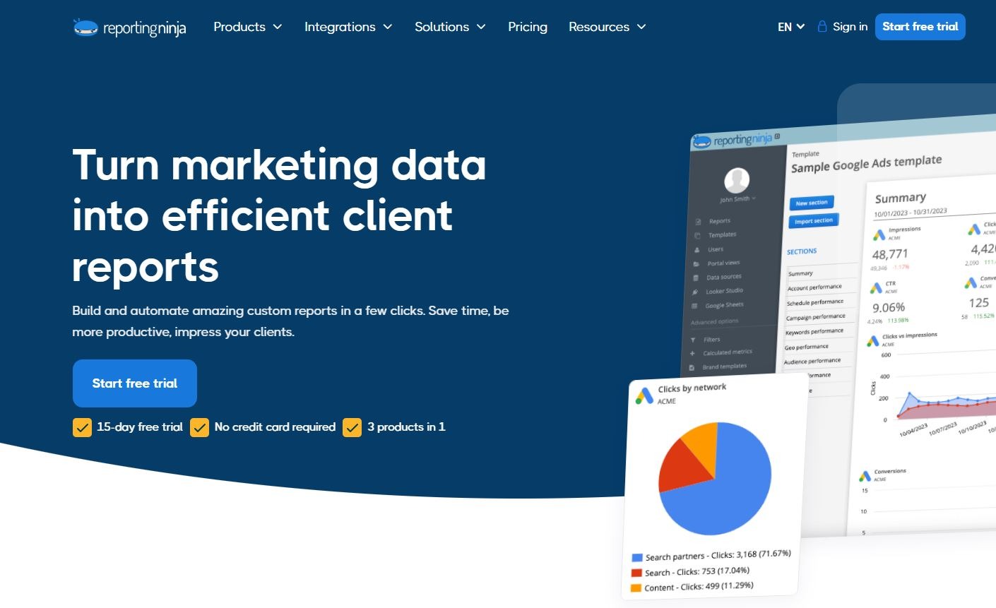
Reporting Ninja is the strongest option for agencies and marketing teams that need to prove SEO ROI without spending hours building reports manually—especially when SEO reporting sits alongside PPC, social, or email activity.
Its biggest strength is flexibility. You get Reporting Ninja's own reporting platform, Looker Studio connectors, and a Google Sheets add-on—so you're not locked into one format. That makes it easy to tailor reporting to different stakeholders without rebuilding from scratch each time.
For teams managing multiple accounts, this balance of automation and flexibility is hard to match. Reports go out consistently, data is pulled the same way every cycle, and the time saved on formatting goes back into analysis and client communication.
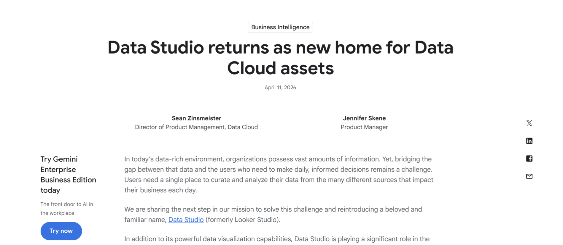
Data Studio (formerly Looker Studio) suits teams that want a customizable dashboard environment and are comfortable with more hands-on setup. If you have clean data, clear metrics, and internal time to maintain dashboards, it's a capable and cost-effective option.
The main trade-off is time. Setup takes longer, connectors need ongoing management, and any change in data sources or stakeholder requirements means rebuilding sections manually.
It's best suited to in-house teams with stable reporting needs; less so for agencies managing multiple changing accounts.
AgencyAnalytics is a well-established choice for agency reporting. It offers a polished experience and is clearly designed for client-facing dashboards—easy to set up and straightforward to hand off to clients.
Where some teams run into friction is at scale. As client count grows or reporting needs expand across more service lines, the Agency Analytics pricing structure can become a bigger consideration.
It remains a solid mid-tier option, but teams that need more control over how their search engine monitoring and reporting scales may find it limiting.
Rankings and sessions don't pay the bills. If your reports can't connect SEO to revenue, you're always one budget review away from losing the argument.
Reporting Ninja's custom reports platform centralizes your data and builds client-ready SEO reports that show what actually matters. Start your free trial today.
Sign up for a 15 days free trial. No credit card required.

Build and automate amazing custom reports in a few clicks. Save time, be more productive, impress your clients.